Is Excel a BI solution? Many of us use Excel in the office or at home to manipulate numbers for better insights and decision-making. Increasingly Excel is used as an entry-level BI tool for data analysis and data preparation. Let’s find out how we can use Excel to visualize and better understand our data.
About the Data
Data Sources
The demonstration data was obtained from the Integrated Devolution Data Portal developed by Kenya’s Commission on Revenue Allocation (CRA) in partnership with the Kenya Association of Manufacturers (KAM). The portal visualizes the revenue sources and budget ceilings for Kenya’s 47 counties from the 2012/2013 to the 2017/2018 financial year.
Projected populations for 2012 to 2014 were obtained from the Country Statistical Abstracts published by the Kenya National Bureau of Statistics (KNBS), after realizing that CRA relies on data from the 2009 National Population and Housing Census in their Per Capita calculations.
Data Preparation
Data from the CRA portal can only be downloaded as a Tableau Workbook, PDF, or Image. I can now confirm that a Tableau Workbook can be exported to a CSV file that can be imported in Excel, but ended up manually entering the data from the portal into Excel. Hopefully CRA will soon share the data from its portal in a more open standard like CSV.
The County Statistical Abstracts project population up to 2014, so population was extrapolated until 2018 based on the 2014 growth rate. The average population over two years was calculated to ensure that the population and financial data reference the same financial year.
The master data that will be used for the Excel visualizations consists of a single Excel table with the following attributes:

Data Visualization
When we talk of data visualization in Excel we immediately think about the creation of charts, typically a pie or column chart. However, before we discuss charts in Excel we’ll visualize our spreadsheet data through aggregation and conditional formatting. At last we’ll look at visualizing our data with maps using the ArcGIS Maps for Office plug-in.
Formatting Spreadsheet Data
Data formatting is an excellent starting point for gaining insights into our data. It helps in our understanding of the data and the detection and correction of errors. If your spreadsheet data is not in Table format, then select any one cell in the spreadsheet, click Format as Table and pick a style of your liking. This will make working with your data a lot easier!

Aggregating Data
As an initial step we’ll add summary statistics to the bottom of each column. To do this select the cell immediately below a column and click the AutoSum button. By default, Excel places the formula in a Table Total Row under the table. To add additional aggregations, simply click a down arrow in the Table Total Row and pick the statistic of your choice.

Conditional Formatting
Since it is difficult to make sense of a whole bunch of numbers, we’ll use conditional formatting to highlight certain aspects of our data.
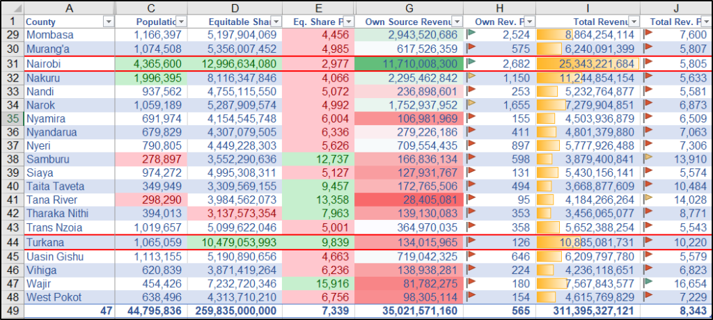
To highlight the distribution of values in the Own Source Revenue and Total Revenue data columns, we select the data in one of these columns, click Conditional Formatting, select either Data Bars, Color Scales or Icon Sets and pick a style or symbol that we like.

Conditional formatting can also highlight outliers in our data or values that are above and below average. As an example, let’s highlight the top and bottom 10% values in the Population and Equitable Share columns, and format the above and below average values in the Equitable Share Per Capita column.

After applying conditional formatting to several columns our table will begin to look like the one below. You must admit that through these visualizations we have gained new insights in our data.

Adding Charts
Creating a visual presentation of our data in the form of a chart is a logical next step. Inserting a chart is not that difficult but finding the right chart based on the data and our objective can be a challenge. Let’s have a look at the common chart types and how they can be used to gain understanding and insight into county revenue allocation in Kenya.
1. Line Chart

Line charts help us to see changes over time. In the example above, we notice a steady increase in revenue allocation from 2013/2014. Surprising is the dip in revenue allocation to Turkana for the 2017/2018 financial year.
2. Column Chart

Column charts are excellent for comparing data. In the example above, we can see that the total revenue for Nairobi County is well above that of the other counties. Notice also that counties like Nairobi, Nakuru and Kiambu are doing well in collecting their own source revenue.
3. Pie Chart

Pie charts are not popular with data scientists, but the one above clearly illustrates that counties largely depend on the central government as a source of revenue.
4. Scatter Plot

Scatter plots are excellent for showing the relationship between two variables. The above example suggests a negative relationship between equitable share per capita and population. In other words, counties with a lower population tend to get a higher equitable share per capita.
5. Histogram

A histogram illustrates the distribution of your data. From the example above, we can conclude that county total revenue per capita doesn’t follow a normal (bell-curve) distribution. The distribution is right-skewed and most counties appear in the lower brackets.
6. Box and Whisker Plot

Box and whisker plots are much liked by statisticians. I am not one, but can tell from the example above that total revenue per capita has a higher variance than equitable share per capita, that the data is right-skewed and that there are outliers in the data.
Inserting Maps
Map visualizations showing the geographic distribution of our data add an exciting new perspective to our data insights and understanding. For example, counties that appear similar and near in a table might appear hugely different in size and far apart when displayed on a map.
Map visualizations are an excellent way of showing the big picture of our data in the context of the world around us. One of the tools that we can use is ArcGIS Maps for Office.
ArcGIS Maps for Office
ArcGIS Maps for Office adds map visualizations to your Excel data. It allows you to publish these maps online as interactive web maps, and embed them into a PowerPoint presentation. To use ArcGIS Maps for Office in Excel simply follow these consecutive steps.
Step 1 – Download and install ArcGIS Maps for Office.

Step 2 – Ensure that you have an ArcGIS Online login or sign up for a free 21-day ArcGIS trial.

Step 3 – Go to the ArcGIS Maps menu and click Sign In to connect to your ArcGIS Online account.

Step 4 – Click Add Map to add a new map to your workbook.

Step 5 – In the Add data from worksheet dialog to select your Data, Location Type (Counties), and Style by Column before clicking Add Data.

Step 6 – Tweak the Layer Style by changing the Style Column, Classification, No. of Classes, and Symbol Style before you click OK.

Step 7 – If all goes well, you will now have a map visualization like the one below, which shows total revenue per capita by county for the year 2015/2016.

In-built Map Tool (Bonus)
You can use this simple tool by selecting the geographic regions and a corresponding attribute in your spreadsheet data before clicking Map on the Insert menu. It will generate a basic interactive map like the one below, which shows county total population as a graduated color.

Conclusion
There you have it, 3 excellent visualizations for your Excel worksheet. I trust you learned something new and would love to hear which visualization you liked best. Kindly share your own experiences with data visualizations in Excel and let us know whether you could recommend it as a BI solution. Leave a comment below or feel free to contact me directly.
