
Data analysis is the process of making sense of data and delivering insights that drive business decisions. Data analytics on the other hand is a discipline that handles the complete management of data. In this article we take a closer look at data analysis.
Data Analysis
Data analysis has been part of research and business operations for decades. It starts with a research question or a business problem that needs to be addressed. Data is then acquired, processed, and analyzed to find the answers. Statistical inference is then used to ascertain that the answers are statistically significant and not a result of chance.
Most of the tools and techniques used for analyzing data like regression and decision trees have been around for decades. What has changed is the sheer volume of data that is being generated by the Internet, social media, and sensor devices. It is now possible to infer models from these large volumes of data, so we might want to listen to what the data is telling us. In addition, parallel computing and deep convolutional neural networks have opened a multitude of new applications in data analysis such as image analysis and natural language processing.
There are 4 main types of data analysis with increasing complexity and value. Each type answers a specific set of questions and serves a unique purpose.
- Descriptive – What happened?
- Diagnostic – Why is it happening?
- Predictive – What will happen next?
- Prescriptive – What must I do?
These types of analysis is explained in more detail below. For illustration we will use an avocado dataset from Kaggle which contains avocado prices and volumes for multiple locations in the USA.
Descriptive Analysis
Descriptive analysis is the first type of analysis that you need to perform. By generating summaries, descriptive statistics and visualizing your data, you get a good grasp of the data you’re working with. In the process you will identify errors and missing data, and identify the key variables that you need to analyze in more depth.
Most businesses use some form of descriptive analysis to keep track of their key performance indicators. One could track sales by product, month, customer, and/or sales rep. and report the findings in a chart or dashboard. Categorical variables can be summarized in a bar charts and the distribution of numeric variables can be shown in a histogram or box plot. Line plots come in very handy if you are working with time series
Example
This first chart shows the distribution of average sales prices for conventional and organic avocados over the 2015 – 2020 period. It tells us that organic avocados tend to be sold at a higher price and have a greater variability in price than conventional avocados.

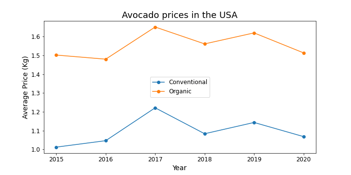
To dig further we want to understand how the average sales price has changed over time. The line chart below shows that average prices were highest in 2017 and declined in 2020. It also shows that the sales price of organic avocados is consistently higher.
Diagnostic Analysis
After examining and exploring your data you might wonder why your data is behaving the way it does. For instance, what caused avocado prices to rise in 2017 and to decline in 2020? At this stage ask all the hard questions and look for the answers by finding relationships within your data. When you find a strong relationship between two variables calculate the correlation coefficient and determine whether the relation is causal. After all, people who live longer eat more salt, but that’s not the reason they live longer.
Most businesses will gain value from finding patterns and relationships in their data. Since it identifies their critical success factors and helps them to take corrective action towards better performance. However, you need to develop your skills in data management, data mining, and statistics or find a reliable and competent partner to work with.
Example
To find out why prices differ by year we need to find an explanatory variable. The first chart shows a boxplot that shows the statistical distribution of avocado prices across the different growing regions in the USA. It indicates that average prices vary significantly by region.

Prices might also vary with total sales volume, so we can use a scatterplot to visualize the relationship between these two variables. The chart below indicates a negative relationship between total sales volume and average price. This is particularly true when the volume passes a certain threshold.

Let’s now find out how the average price and total sales volume have changed over time with a line chart. The chart below suggests that volume reduced in 2020, but this is due to incomplete data for the year 2020. In fact, total volume for 2020 was on track to surpass that of 2019, and this might have caused a glut in the market.

Predictive Analysis
After determining the factors that impact your business performance you can decide to move on to predictive analysis. At this stage you will build a model that can predict your business performance based on changes in internal and external conditions. For instance, how are ice cream sales likely to be impacted based on the weather forecast or how will the opening of a new store impact your bottom line.
Predictive analysis hinges on the availability of a reliable model. While larger businesses are increasingly turning to AI and advanced analytics, smaller business face several challenges. They might lack the data, the skills or the investment needed for research and development of such solutions. To use our example, a model to predict volumes and prices of avocado in the USA will require a lot more data and a considerable investment in time and money.
Prescriptive Analysis
Prescriptive analysis takes predictive analysis a step further and recommends the best action that a company should take ahead of an eventual event. Very few businesses have the capacity to implement predictive analysis since it requires massive amounts of data, cloud storage solutions in the form of data lakes and data warehouses, parallel computing, and advanced skills in AI and modeling.
Wrapping Up
In this article you learned the difference between data analysis and data analytics and how the two are related. We then dived deeper in the four main types of data analysis, which can be summarized as follows:
- Descriptive – What happened?
- Diagnostic – Why is it happening?
- Predictive – What will happen next?
- Prescriptive – What must I do?
The example that we used illustrated descriptive and diagnostic analysis, since predictive and prescriptive analysis requires a lot more data. Now that you have understood the different types of data analysis you ought to consider how you can use descriptive and diagnostic analysis within your organization.
Do contact us if you need help or further information.