
I just completed Essential Statistics for Data Analysis using Excel and I realized that statistics can be very enjoyable. Especially when you develop hands-on skills and are given practical examples with interesting data and insights. It inspired me to write this article on descriptive statistics, which uses some of Kenya’s open datasets. Have fun!
Why Descriptive Statistics
A common goal in working with data is to gain insights that inform decision-making. When you work with data that’s new or unfamiliar, you first need to explore the data and structure it to facilitate further investigation. In practical terms you will often organize the data in a spreadsheet so that each row represents an instance and each row represents a different variable.
With the data in place we can seek answers to common questions and gain a better understanding of the data. Descriptive statistics provides a rich toolset that helps us to do just that. Let’s take a closer look at some of the typical tools that you use as a data analyst or data scientist.
Histograms
A histogram looks like a fancy column chart, but it is only used for continuous data that occurs within a range. Each column in a histogram is a bin that counts the number of occurrences of your values within the indicated range. Let’s look at a few examples to explain this further.

The example on the left shows the distribution of country poverty rate estimates based on KIHBS data from 2005/6. From the histogram we learn that 11 counties had a poverty rate between 40% – 50%, but the distribution looks symmetric and resembles a normal distribution.
The example on the right shows the distribution of country populations. The histogram indicates that 27 out of 47 counties have a population between ½ and 1 million. Nairobi County is a clear outlier with a population of 3+ million, and this skews the distribution to the right.
Histograms can also be used for comparison as in the example of secondary school enrollment for 2007 below. Interestingly, small school sizes are most frequent for both private and public schools. The difference is that public school sizes are more spread out and an enrollment of over 500 is quite common for public schools but very rare for private schools.

Central Tendency, Variability, and Distribution
Descriptive statistics describe the central tendency, variability, and distribution of your data. Mean, median and mode are common measures for central tendency. They are calculated as the average, middle, and most frequent value in your data respectively.
Variability in your data can be expressed as range, variance, standard deviation, and standard error. Range is the difference between the maximum and minimum value, while variance is calculated as the average squared deviation from the mean. Standard deviation is the square root of the variance and indicates difference from the mean. Standard error measures the representativeness of a sample and is calculated as the standard deviation divided by the square root of the sample size.
The distribution of your data is normally visualized as a histogram, box plot or pareto chart, but it can also be measured as skewness and kurtosis. Skewness measures how much your data skews to the right or to the left, while kurtosis measure the size of the two tails in your distribution. You might expect your data to follow a normal or bell-shaped distribution, but bimodal, uniform, or random distribution are also common.
In Excel you can calculate these statistics through individual functions like MEDIAN( ) and VAR( ), but you can also calculate a whole set of descriptive statistics at once with the Descriptive Statistics tool in the Data Analysis ToolPak. I ran the tool on monthly number of patients for 4 hospitals in Nakuru county from January 2012 until September 2016 and some of the key statistics are shown below.

Notice that the values for mean and median are different, and that 3 out of 4 hospitals have a larger mean indicative of positive skew in the data. The standard deviation for Naivasha subcounty hospital is relatively high in comparison to the other hospitals and this presents a challenge in handling all patients. The positive values for skewness and kurtosis at Gilgil subcounty hospital tell us that there’s a long right tail in the data.
Box Plots
Another way to visualize your data is a box plot or box and whisker plot. It depicts the descriptive statistics of your data in the following manner:
- The box shows the second and third quartile of your data and thus contains 50% of your data. The straight line within the box represents the median, which is the middle value in your data.
- The whiskers that extend on both sides of the box represent the first 25% and last 25% of your data, but they exclude the outliers in your data.
- The outliers which lie beyond 1.5 times the interquartile range from the mean are drawn separately as dots.
- The mean which as we have learned is different from the mean is drawn as a star and is likely to be found within the box.
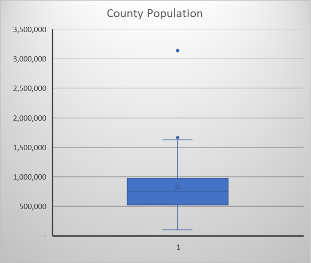
The box plot for county populations confirms our earlier observations from the histogram, but it leaves no room for dispute. Here are the key observations:
- The box representing 50% of the data clearly falls between ½ to 1 million. You can also see that the mean shown as a star is above the median shown as a straight line.
- The 1st quartile extends from the bottom of the box to the county with the lowest population, which is Lamu with a population of 101,539.
- The 4th quartile whisker which extends from the top of the box is clearly larger than the bottom whisker and indicates that the data is positively skewed.
- The two outliers beyond the top whisker are clearly visible. These represent the counties of Mombasa and Nairobi with a population of 1,660,651 and 3,138,569 respectively.
Due to their compactness box plots are excellent for making comparisons for multiple populations with multiple variables. Below is an example based on Kenya’s gross marketed production for major cash crops over 3 time-periods.

This box plot tells different stories in a single visualization. Observe how revenue from poultry and eggs, and dairy products is on the rise, while coffee is in decline. Also notice that maize revenue was highly variable in 2006-2010 and that dairy revenue showed the highest variance in 2001-2005.
Visualizing Categorical Data
Until now we have looked at descriptive statistics for continuous data, but you will often be working with categorical data. Histograms, box plots, mean and variance have no meaning, but you can tabulate and visualize categorical in a variety of ways.
Column charts and pie charts are best suited for summarizing nominal data that is in no order, while column charts are best for summarizing ordinal data. Pivot tables and charts help you to look at the different dimensions in your data and are good for finding relationships between different variables. To illustrate the power of pivot tables and charts let’s look at a few examples.
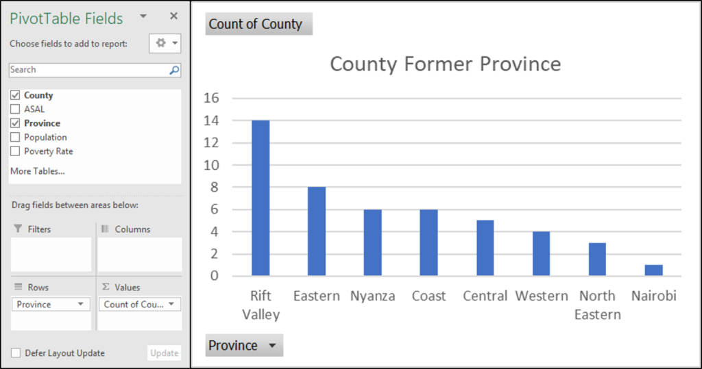
The example above shows the former province of Kenya’s 47 counties. It’s a simple graph, but it clearly illustrates that the biggest number of counties belonged to Rift Valley province.
The example below shows the number of counties that fall into each of the five poverty index brackets. To create this visualization the poverty rates in the dataset were grouped into 5 brackets.

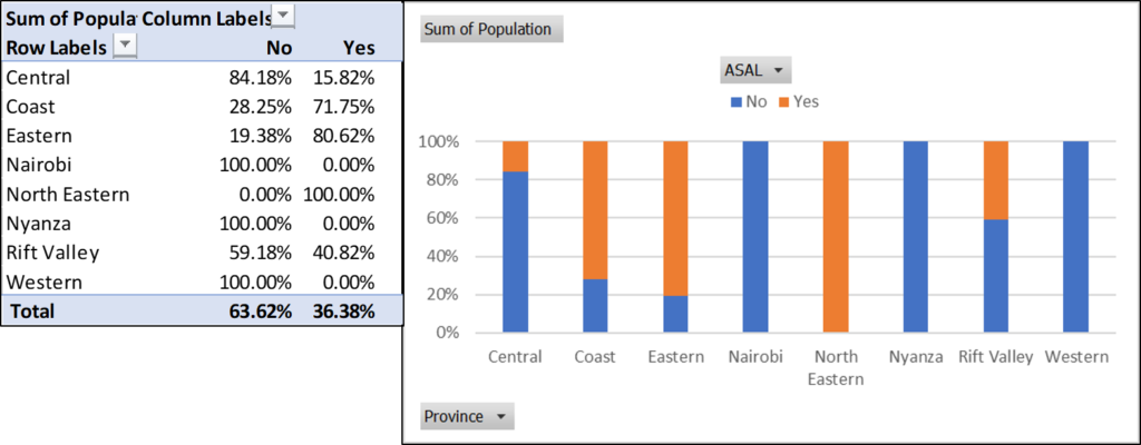
Pivot tables and charts can also be used to create crosstabs, which are used to discover the relationships between different variables. The example below shows the percentage of the population that lives in arid and semi-arid land (ASAL) for each of the former provinces. We think that the coast has a lot of rain, but most people in the former coast province live in dry areas.
Pareto Charts
The Pareto principle or 80/20 rule states that 20% of the inputs are responsible for 80% of the results. For 20% of a company’s products generate 80% of the revenue or 20% of the issues results in 80% of the customer complaints. Pareto charts help us to discover which inputs are responsible for 80% of the outputs. Business can make good use of Pareto charts, since they tell them what they need to focus on for getting better results.
The example below shows own source revenue for each county in the year 2015-16. Close to 70% of the total revenue is collected by 9 counties, and this is not far off from the Pareto principle.

Time and Location Reference
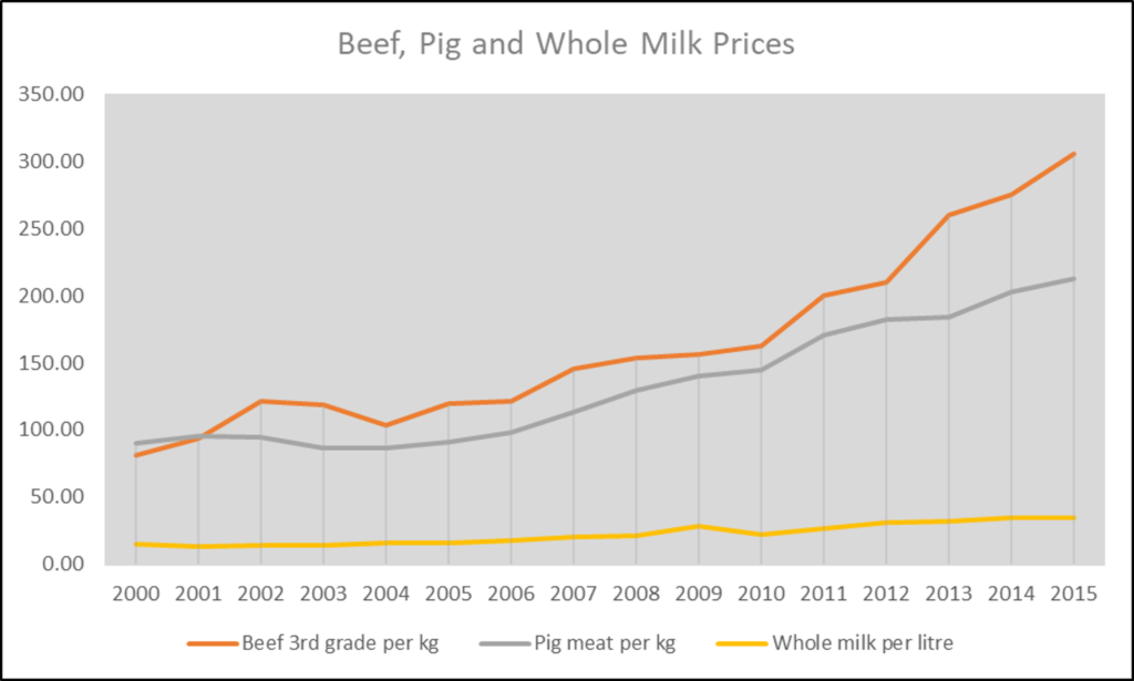
When your data has a time or location reference you need to be on the lookout for trends. A temporal trend in your data can be discovered with a time series that displays time along the x-axis and a quantitative variable of interest along the y-axis. The example below clearly shows how prices of beef, pig meat and milk have been increasing over time in Kenya.
If your data has a location reference like Lat/Long, address, city, county, or country, you can create a map to show the geographic distribution of a variable of interest. In the example below, we notice that household sizes are smallest around Nairobi and in Central Kenya and much larger in Northern and Northeastern Kenya.

Wrapping Up
A picture says more than a thousand words, so histograms and box plots are popular tools to present a snapshot of the central tendency, variability, and distribution of continuous data. In addition, you could use the Descriptive Statistics tool in Excel to calculate the mean, median, variance, standard deviation, skewness, kurtosis, and other summary statistics.
These descriptive statistics don’t make sense for categorical data, but we can summarize categorical data with counts, and percentages. Pivot tables offer a convenient way for doing this in Excel and pivot charts can be used to visualize the summary statistics as column charts.
Relationships and trends in your data can be discovered with cross tabs, line graphs and filled maps and Pareto charts reveal to us which problems or causes are most significant in a process.
In the later stages of analysis more advanced statistics like probabilities, regression, and hypothesis testing will be needed, but these all build on the basic understanding of your data. You better go and have fun with the descriptive statistics that you just learned.