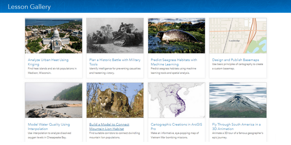
The term GIS is losing some of its appeal to the buzz of geospatial, location intelligence, and spatial data science. Yet the popularity of these offshoots has increased the demand for GIS skills and capabilities, More people are becoming interested in learning GIS and the ArcGIS Lesson Gallery is an excellent school.
The ArcGIS Lesson Gallery offers an innovative way for acquiring relevant GIS skills through a series of short lessons. One such relevant skill is cartography, the study, and practice of making maps. Cartographers came to prominence in the age of exploration, but the discipline lost appeal with the emergence of Google Maps and satellite imagery. Cartography is now making a comeback with an unprecedented demand for GIS-savvy cartographers who can derive insights from increasing amounts of geospatial data
ArcGIS Lessons
ArcGIS Lessons have been around for a couple of years, but I only completed my first lesson Get Started with ArcGIS Pro in October 2017 when I took an interest in ArcGIS Pro. I immediately enjoyed the format of the lessons, which is geared to skills acquisition via the completion of compelling workflows.
The number of ArcGIS Lessons keeps growing and the Lesson Gallery now contains 74 lessons, 5 of them being added while I was writing this article. Who doesn’t get hooked by titles like Monitor Whales with a Multilingual Survey or Get Started with ArcGIS Online which make you familiar with a new product?
I completed lessons on ArcGIS Online and apps like Insights and GeoPlanner, before deciding to complete all lessons on ArcGIS Pro. There are 22 of them and each lesson takes 1-2 hours, so that kept me busy for about a month. It’s not good to keep a good thing to yourself, so I will be sharing some of the exciting things that I learned starting with this article.
The ArcGIS Pro lessons cover advanced topics like spatial analysis, machine learning, 3D visualization and imagery, and remote sensing, but I’ll first share my insights on the cartography lessons. Anyone will benefit from the ability to make beautiful maps and as mentioned the skill is in high demand. Here are the ArcGIS lessons that we will discuss:
- Get Started with ArcGIS Pro – Create 2D and 3D maps to analyze flooding in Venice, Italy.
- Design and Publish Basemaps – Use basic principles of cartography to create a custom basemap.
- Cartographic Creations in ArcGIS Pro – Make an informative, eye-popping map of Vietnam War bombing missions.
Getting Started with ArcGIS Pro
In this lesson, you build a 3D map of the beautiful city of Venice with its famous landmarks. You’ll then analyze and quantify the threat of high tide and give the scene a realistic appearance before sharing it with others online.
This is an introductory lesson to ArcGIS Pro and introduces all the basic concepts. To demonstrate that ArcGIS Pro provides a seamless environment for working with 2D and 3D data, you’ll get to do some exciting 3D visualizations.
Extruding 2D features
In a 3D map, you’ll drag a layer of structures from the 2D layers to the 3D layers. You then select the extrusion Type, pick the Height Field as your feature attribute, and leave the Units unchanged in the Extrusion group in the Appearance ribbon. Simple but effective.

Adding a Rule Package
To make your structures more realistic you’ll apply textures to them. To do this you’ll click the symbol, change the fill symbology to Procedural Fill and import a Rule package that was developed in CityEngine. You’ll map one of the rules to your feature attributes and click Apply. The city of Venice now takes on a realistic look, especially after changing the Basemap to Imagery.

Adding a 3D Building
Adding a texture is fine for most of the structures in Venice, but for landmarks like the Piazza San Marco more detail will bring out their unique architecture. In the lesson, you’ll import 3D features from a layer without any need for symbolization. You’ll then remove the duplicated features from the original structures layer. You’ll be pleased with the result.

The completion of this lesson helped me to appreciate ArcGIS Pro and challenges me to develop a 3D model for a major or scenic town in Kenya. Such a model would present a realistic view of the town and facilitate a multitude of urban planning applications like zoning and permitting.
Design and Publish Basemaps
In this lesson, you design a basemap tailored to a local area, which is more suitable than a basemap for the entire world. You’ll symbolize the data in a manner that creates a visual hierarchy between the different layers and use scale-dependent symbology to ensure that the map looks good when zoomed in and out.
The lesson builds your skills in symbolizing and labeling data and introduces scale-dependent rendering of your feature data. Here’s a summary of the key lessons.
Symbolizing Roads
Under Symbology, I used Unique Values to symbolize roads by road type. The Label for each road type which defaults to the attribute value was then changed to a meaningful description. Under Format Style I learned that the use of symbols in the Gallery (e.g. Major Road, Minor Road) maintains the visual hierarchy between the road levels. Enable symbol layer drawing was used to ensure that roads are symbolized as a continuous layer rather than individual segments.

Scale-dependent Symbology
The roads look fine when zoomed in but the local roads dominate the display when zoomed out. To fix this problem we can use scale-dependent symbology. On clicking the Scale range view button in the Symbology pane a list of scale ranges shows for each road category. From here I selected the local roads, clicked the Add alternate symbol button and then changed the symbol’s properties. Finally, I dragged the scale slider for the group to a scale of 1:24,000. As a result, local roads are drawn with the original symbol when zoomed in beyond 1:24,000 and drawn with the new symbol when zoomed out beyond 1:24,000.

Labeling Roads
Labeling features is a tedious process, but all needed tools were at hand on the Labeling ribbon and in the Label Class pane. The latter opens on clicking the SQL Query button on the ribbon. In the Label Class pane, I created label classes for major and local roads using SQL query. Label expression was then used to define the labels and Position to set rules for Conflict resolution to Remove duplicate labels. On the ribbon, I picked a label style from the Text Symbol group and in the Visibility group I set the Out Beyond scale for major and local roads. This ensured that local roads aren’t labeled when zoomed out beyond a scale of 1:24,000 and that major roads aren’t labeled when zoomed out beyond a scale of 1:100,000.

Completion of this lesson taught me how to build a custom basemap for a local region. I can apply these skills by building a basemap for a County Government in Kenya or a project area. As a challenge, I could even develop a series of basemaps with different styles to be used for different types of maps.
Cartographic Creations in ArcGIS Pro
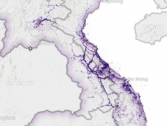
The Vietnam War happened long ago, but this lesson made it come to live with eye-catching cartography. The final output shows where the 7.5 million tons of bombs were dropped on Vietnam, Laos, and Cambodia and highlights some of the key battles.
The entire lesson focuses on cartographic map production, and I strongly recommend that you complete it on your own. For now, let me pick some of the best things that I learned.
Symbolizing Bombing Missions
If you wonder how to display over 1 million points on a map without cluttering the display, this lesson will teach you. After opening the Symbology pane for the Bombing Missions layer, I clicked Properties and headed to the Layers tab. After clicking the Color fill and the Color Properties in the color picker, I changed the color of the points to HEX # code 4C0073 and the Transparency to 98%. I then changed the Outline color to No color and the Size of the points to 1.3 pt and hit Apply to commit the changes. It takes a while for the points to draw but areas of high density show prominently against a neutral background.

Highlight Area of Interest
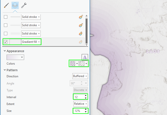
Here’s a neat technique that highlights the countries of Vietnam, Laos, and Cambodia which had been merged in a previous step. On opening the Symbology pane for the merged layer, you uncheck the stroke layers and change the Solid Fill to a Gradient Fil. Now in the Appearance section, you set the Color properties for the left color and set the HEX # to 4C0073 and the Transparency to 90%. You repeat this for the right color but set its Transparency to 100%. Then in the Pattern section, you change the Interval to 12 and the Size to 12% before hitting Apply. Now the area of interest is highlighted on your map in a subtle way.

Aggregation into Hexbins
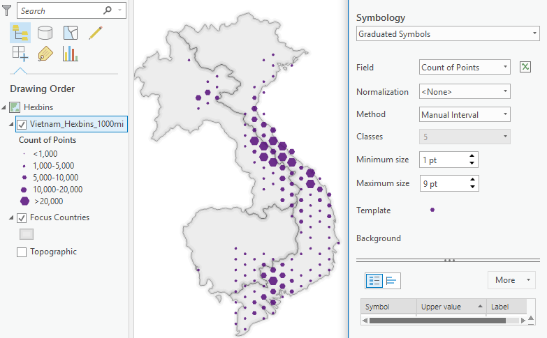
The final layout of this lesson has an inset map that shows the general distribution of the bombing mission using hexagonal bins. To produce this map you first create empty bins with the Generate Tessellation tool setting the bin size of 1,000 square miles. The number of bombing mission within each hexbin is then calculated with the Summarize Within tool and the empty bins are automatically removed by unchecking Keep all input polygons. As a final step, the hexbins are classified and assigned a graduated color.

Completion of this lesson made me feel like a cartographic Ninja. I want to learn more and do some experimentation on my own, but already have a few tricks under my belt. This will allow me to tell a captivating story about the history or current state of Kenya and other geographies.
Wrapping Up
The ArcGIS Lesson Gallery has improved my proficiency in ArcGIS Pro and introduced me to some exciting products and applications. Moreover, the gallery has opened my mind to the kind of problems that GIS can solve and challenged me to apply what I’ve learned in my own context.
The lessons are focused and enjoyable and can be completed in 1-2 hours. They get you started with the basics but quickly move into advanced topics that help you to stand out in the work you do. I recommend that you head over to the ArcGIS Lesson Gallery and try one yourself.
As a GIS practitioner take a get started lesson, or one of the new learning paths taking you through a lesson sequence. If you are new to GIS, head over to the gallery and find out problems GIS can solve. You could learn GIS yourself, or contact us to develop a GIS solution for you.
