Anyone loves a good story, even more so when it is true. This explains the quest for data-driven visual storytelling in all spheres of life across the world. Could it help me as a Geospatial Data Scientist to reach a wider audience and make a bigger impact? Let us find out.
Introduction
Early 2017 I started a blog that ought to have propelled my company Spatiality to worldwide success. After frantically blogging about all things digital for 6 months, I found a new quest in data visualization. This in turn triggered an interest in data science, completion of the MPP Data Science Track, and DataCamp’s Data Scientist with Python Career Track.
Now in 2019 I realize that the new learning might have kept me from finding work in the geospatial industry. However, there’s little regret since other industry players have struggled due to a poor economy and low technology adoption rates. With my new-found skills I can now focus on data-driven visual storytelling and educate the market on the benefits of using data and technology.
So how does one tell a data-driven visual story in Kenya? Elsewhere one could design a story and find the data to support it. In Kenya with limited data in the public domain, one must look in hidden places and compile data in creative ways. For this first story, I will use the data generated by my company blog which is stored in WordPress.
Spatiality Blog
Over the last 2 years 40 blog posts have been published under the blog section of the Spatiality website. Many of the posts continue to be promoted on Twitter and this has resulted in website visits, mailing list subscribers and more awareness about Spatiality and myself.
The website is a self-managed WordPress site and I have full control over the creation and categorization of the blog posts. There have been some changes, but currently the blog posts are categorized under the following categories:
- Digital Transformation – In the first half of 2017 I was acquainting myself on digital marketing and shared my insights through blog posts.
- Cloud Computing – To prepare for the migration of GIS to the cloud I started writing about cloud computing and common cloud solutions.
- Geospatial Technology – My career is in the geospatial industry, so I write luminary articles about GIS products and services.
- Data Science – Since October 2017 I started writing on data science to emphasize its synergies with Geospatial Technology and practice my new-found skills.
My blogging has become increasingly intermittent, but with a focus on data-driven visual storytelling there will be no shortage of topics to write about. Insights from the upcoming analysis of historic blog posts might even inform my decision-making and help me to take the required action.
Blog Analysis
The purpose of the analysis is to obtain insights from my previous blogging and answer the following questions:
- How has my blogging changed over time?
- Has this impacted the no. of social shares?
To answer these questions, I populated an Excel spreadsheet with the following fields:
- Blog_id – sequential number that uniquely identifies each blog post
- Title – the title/headline of the blog post
- Category – primary category under which the blog post has been published. The 4 unique categories are:
- Cloud Computing
- Data Science
- Digital Transformation
- Geospatial Technology
- Date – date on which the blog post was published
- Gap – the number of days between the current and previous blog post
- Words – the length of the blog post in number of words
- Shares – the number of social shares recorded by WordPress
Since all records were correctly and completely entered there was no need for data cleaning, but normally this is an activity that you’ll probably spend most of your time on as a data scientist.
The environment used for the analysis consists of a Python Anaconda Data Science environment set up on a local machine. Apart from regular Python we will use the Numpy, Pandas, Matplotlib, and Seaborn libraries for data manipulation, analysis and visualization.
After firing up Python in a Jupyter notebook, we import the spreadsheet in Python as a Pandas dataframe using the read_csv method. Since our data uses a European date format, we use the argument dayfirst=True to parse the dates correctly. Here’s the header of the newly created dataframe.

Observe that Date appears as a row index and that Blog_id, Title, Category, Gap, Words, and Shares appear as column indexes.
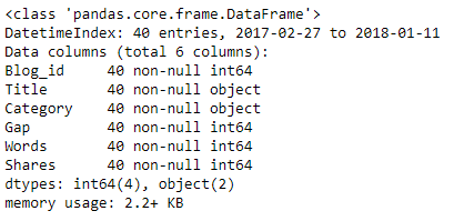
For more information on the dataframe we now use the info method.

From this report we note that the dataframe has a Datetime Index, 40 entries and 6 columns. From the report we can also derive that there are no missing values and that the dataframe has 4 numeric fields of type integer and 4 categorical fields of type object.
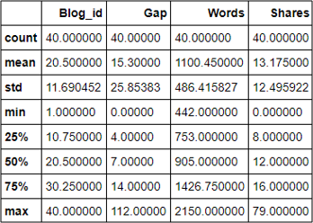
Let’s now obtain some summary statistics for the numeric variables, typically called features, using the describe method.

The high values for standard deviation in comparison with the mean indicate that the data for Gap, Words, and Shares is highly dispersed. This is to be expected for a small dataset like ours and the values that tell us the most are the mean, min and max values.
Data Visualization
Data visualization is an important component of our exploratory data analysis since it shows the data distribution and uncovers patterns and relationships within our data.
We’ll start by plotting the values for Gaps, Words and Shares over time using line graphs. We’ll use subplots for clarity since the 3 variables use different scales.

From these graphs we can make the following observations:
- Blogging was consistent in two periods, from Feb. to June ’17 and from Oct. ’17 until Feb. ’18. The frequency of blogging has reduced over time from 2 posts per week to 1 or 2 per month.
- The length of the blog posts has increased from 500-1000 words in the first half of 2017 to 1500 – 2000 words in the period thereafter.
- The number of social shares has remained between 0 and 26 apart from a notable outlier of 79 shares for the blog post “5 immediate reasons for upgrading to ArcGIS Pro”.
To explore the distribution of the post lengths let’s create a histogram:

The histogram tells us that 750-1000 words has the highest frequency of blog posts. We also note that the distribution is positively-skewed with a tail on the right side.
To know how the distribution differs by category we use a Seaborn boxplot.

From this boxplot we can make the following observations:
- Geospatial Technology blog posts show the highest variability in blog post length and the distribution is positively skewed with a long right tail.
- Data Science blog posts have a significantly longer length than all the other categories.
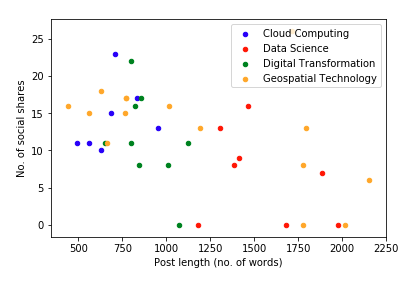
A relationship between two variables can be visualized with a scatter plot, while the effect of other variables can be visualized by size and color of the markers. The scatter plot below plots the no. of social shares against blog post length and used color to distinguish between the different blog categories. Note that the outlier that had 79 shares was excluded through Boolean filtering on the original dataframe.

Clearly there appears to be no relationship between the blog post length and the number of social shares.
To quickly find out if there’s a relationship between any two numeric variables we can use the Seaborn pairplot. A pairplot creates histograms for each numeric variable along the diagonal and scatter plots for each pairwise combination in a symmetric fashion. Here’s how the scatter plot looks like for our data.

The only two variables that show a relationship are Blog_id and Words. The relationship is positive and affirms to us that the length of my blog posts has been increasing with new blog posts.
Wrapping Up
Allow me to wrap up with a few comments, observations, and recommendations.
- I had to get used to the concept of data-driven storytelling, but the clarity of the data, the creativity in visualization and the freedom of expression gives one a lot to work with.
- The limited amount of data for my blog was a limiting factor, but I had the opportunity to practice my Python skills and get into the nitty-gritty of plotting.
- The analysis of my blog posts has motivated me to continue blogging and made me realize that I need to track other statistics like post views and blog post promotion on social media.
- The analysis seemed inconclusive, but social share counts are becoming irrelevant. Some social media channels no longer track share counts, and counts can easily be manipulated.
- Going forward I will measure the success of my blog posts by how much fun I have in writing them. Kindly, let me know how much fun you have in reading them!
